
Context
While at Springboard’s UX/UI bootcamp I was connected with Pet 911. Springboard has their students collaborate with businesses looking for UX work. For this project I was introduced to two other students from Springboard, Lisa and Rachel, with whom I would be working on this project. Before meeting the Pet911 stakeholders we were told the project would be to
“Design an international mobile app based on Pet 911's website.”
After emailing back and forth, my co students and I had a meeting with the Pet 911 stakeholders where we discusses the goals and hopes for the project. The stakeholders told us the reason they wanted to create an english language app was to expand internationally to help pet owners in countries outside of Russia reunite with their lost pets. They hoped that by expanding their user base outside of Russia they could increase revenue. The stakeholders did not know where they were hoping to expand yet and suggested a english language app because they could use it to translate into other languages when they did decide where to launch.

Project Constraints:
1 month project (40 hrs)
4 different time zones
My co-students and I had a one month timeline and were told to allot approximately 40 hours of work to the project. We were also working in 4 different time zones with my co students and I living across America and the Russian stakeholders currently residing in thailand.
Stakeholder Goals:
Help pet owners reunite with their lost pets through an English-language mobile application.
Increase visitor numbers and the number of users paying for premium services.
Scaling Back and Finding Focus
We decided we needed to narrow the scope of the project due to limited time and budget.
After meeting with the stakeholder the springboard students and I discussed what we had learned. We wanted to make sure we could produce quality work in the 40 hours allotted, and felt that trying to create a high fidelity application ready to be sent off to developers that would be accessible to an international market wasn’t realistic. We looked at the existing mobile site and took into account the stakeholders goals and decided to focus on a feature rather than the whole app. We decided to focus on the listing process.
The Listing Process:
The first interactive feature users experience
It is integral in the user experience
It is where Pet 911 makes the majority of their revenue
By focusing on the listing process my co-students and I felt confident we could fulfill the stakeholder’s goals and produce quality work in the time we were given. We came up with a problem statement that focused on the direction we were hoping to go.

Problem Statement:
Users of varying ability levels and with differing levels of internet access need to be able to post listings about lost and found pets in an easy and efficient way on a mobile app.
Scope and Timeline
My co students and I wrote up a project timeline and scope document to share with the stakeholders to get approval for the direction we were heading.
We decided to focus on
Research
Research Synthesis
Sketching
Guerilla Testing
Mid - Fidelity Wireframes
We decided our final deliverable for the Pet 911 team would be mid-fidelity wireframes of the listing process. The stakeholders reviewed and agreed to our plan.

Final Deliverable
The culmination of a month's work were mid fidelity wireframes of the listing process focusing on two flows. The “Lost a Pet” flow and the “Found a Pet” flow. We presented these designs so that could be used as a jumping off point for the design of the rest of the app.

Dogs, cats, and pain points
To start researching my co-students and I decided on which research methods would be the most effective within the short timespan of the project. We divided up the workload and shared our research with one another. View Research Plan
Methodologies:
1. Analytics Review and Desk Research
We reviewed screenshots from Pet 911’s Google Analytics to better undertsand the users. To supplement the demographics data we researched the field, reviewing articles and industry reports.
Top Insights:
Pet owners are a diverse and varied group;
in age, gender, nationality and socioeconomic status
Dogs and Cats are the most commonly owned pets globally
Pet ownership and the pet industry are on the rise
Losing a pet is a common problem on a global scale and the safe return of said pet is desired by the vast majority of pet owners
2. Heuristic Evaluation of Pet 911 Website
To uncover critical usability issues with the existing platform my co-student Rachael went through the listing process of Pet 911’s current mobile website and analyzied it using Nielsen Norman-approved heuristics’
Top Insights:
The two listing flows were not varied or distinct in any way
Which does not take into account the emotional state of the users
There are a lot of options for paid services at the end of the listing process which can be overwhelming
Pet 911’s site has distracting incongruities and unnecessary information
3. Direct and Indirect Competitor Evaluations
By looking at the solutions competitors had come up with we could learn what features and flows were successfully implemented and also uncover usability issues that could be avoided in redesigning Pet 911’s listing process. My co-student Lisa looked at direct competitors specifically other lost pet apps on the market, while I looked at indirect competitors that have successful listing processes.
View Indirect Competitor Evaluation
View Direct Competitor Evaluation



Karina and Alex’s pet problems
With research complete and synthesis underway we decided to use our demographics data to create personas to help us visualize the needs of the user. Persona deliverables were created by Lisa Dahlgren using illustrations by Humaaans.
26 year old Karina embodies Pet 911’s younger audience and the people who love their pets. She is the unfortunate soul whose pet is missing and desperately wants her labradoodle Pepsi back. She uses apps and technology often but in this emotional time gets overwhelmed easily.
Alex represents the older users, at 47 years old he is less comfortable than Karina with technology and too busy with his job and family for a pet. He is the hero who found a lost pet and is trying to return the mysterious cat back to its owner without too much conflict or confusion.
Synthesis
Top Insights Overall:
We consolidated insights from the information observed and recorded in the various research methodologies. From these insights we distilled common and overlapping themes. We wrote up all of our insights in a Research Synthesis Report.
Pet 911’s demographic are a diverse group; varying in age, gender, nationality and socioeconomic status.
Pet 911 needs to have an intuative platform that anticipate the users needs.
Pet 911 needs to work to reduce the users cognitive load.
Pet 911 needs to give users a sense of control throughout the listing process.
User Stories
Using these personas, my co-students and I were able to empathize with our users. I created a template to create user stories that my co-students and I filled out. By writing out statements explaining the needs of users and the reasons behind those needs we were able to start visualizing what the listing process could look like and how to create solutions to the discovered pain points.

Lovely collaboration
My co-students and I then began the process of ideation and sketching, however we struggled to get started and figure out how to collaborate.
Crazy 8’s
I suggested we spend our next meeting on a Crazy 8’s exercise and ended up leading the brainstorming session. We all worked on our eight, one minute drawing.
Brief : “What would we want the user to see upon opening the app?”
We all came back and shared images of the quick sketches we produced. We walked through and spoke about each “screen” and how it related to our personas and research, then would respond to one another. This process helped to get our creativity flowing and allowed us to feel more comfortable sharing ideas with one another. It also informed the first three screens we would create for the onboarding process.
User Flow
We then created a very basic user flow that helped us to define what screens would be needed for both the lost and found flows. We felt that having tailored flows for users who came to Pet 911 having lost or found a pet was important.

We all drew cute dogs
After warming up with the Crazy 8’s exercise and defining our user flow we spent a day sketching out the lofi red routes. My co-students and I found another time to meet in order to review our work and discuss the next iterations. I suggested that we each spend a few minutes going over the two flows we had created and giving explanations for features and design choices.
After presenting our work we critiqued each other and discussed what we thought worked best in each version of our sketches. We then created a plan to do one more round of sketching with our finalized ideas. We also discussed trying to use similar elements and handwriting to create a sense of continuity.
Final Sketches
To make the final sketches feel cohesive I reworked the scans of everyone's sketches in Photoshop editing and redesigned a few elements. View Final Sketches
My co-students and I made sure to focus on adapting the listing process from the website to an app friendly version that would:
Address pain points from the Heuristic Evaluation
Empathize with the users and their emotional state
Consider current solutions found in similar applications
Onboarding
We decided the app should open to an onboarding sequence to help the user gain trust in the product.
Pet 911’s website had an explanation of how their site works with icons. However it was buried in their website so that users were unlikely to see it
We expanded on this idea and made it the first thing new users would see when opening the app.
Sensative Language
We also changed the language to be more sensitive to the user experience.
For example we reworded the listing CTA button saying to make sure that the app is not placing blame.
“I lost my pet”
was changed to
“My pet is missing”
Controlling the Chaos
We added a clear progress bar to help users feel in control so that users would know where they were in the listing process and what they had left to do.
We also added in a back button and an “x” so that users could move through and exit the process at any time.
Single Flow —> Two Distinct Flows
The Pet 911 mobile site had one listing flow. We decided that our two personas emotional states were different enough to require tailored listing processes. We made two distinct red routes each with specific language and different questions.
Lost a Pet
and
Found a Pet
Strike a Balance to Reduce Cognitive Load
The Pet 911 website had all the listing details on two pages and users would scroll to see the questions. To reduce cognitive load and to conform to industry standards for app design, we grouped questions by type and had them displayed on individual screens so that all questions were visible without scrolling.
We tried to strike a balance between the number of screens and number of questions.
Payment Choice Paralysis
At the end of the listing the Pet 911 website had many different payment options available to the user. This many options could create choice paralysis and be overwhelming. We combined similar services and made 3 payment options to reduce cognitive load, user drop off and encourage more people to pay for services. We also turned the payment options page into a bottom sheet, to help users feel in control of the process and keep them on the posting page.

Guerilla Testing
After completing the final version of our sketches my co-students and I each conducted a Moderated Guerilla Usability Test.
We conducted three tests with different participants between the ages of 18-69 who had experience as pet owners and/or finding pets that belong to others. Our test participants were recruited amongst friends and family. The tests were between 30 and 40 minutes and moderated directly.
Using a test script we wrote we asked the participants to respond to our sketches of two different flows and asked them to perform tasks and answer questions about the sketches they were interacting with.
We wanted to uncover usability issues with the Pet 911 app’s navigation, hierarchy, visuals and word choice and discover whether or not users would be willing to pay for premium services.
Stakeholder Feedback and Cultural Differences
After reviewing the sketches the stakeholders of Pet 911 gave us their feedback. They asked us to make some minor changes such as some wording and rearranging the navigation bar, as well as some major changes.
They asked us to move the contact info to the start of the listing process. My co-students and I were worried that asking for contact information so early in the listing process might create user drop off, as people are generally reluctant to enter personal information into an app without already being invested in the process.
Because it was important to the stakeholders, we worked on coming up with a solution that would satisfy their request and keep users from leaving the platform.
Cultural Differences:
One request the stakeholders made was to remove the “Pets Name” field from the “lost” a pet flow. My co-students and I felt it was an important field because it was the first thing we saw people add in their posts on other lost pet apps among other reasons.
However the stakeholder said:
“In Russia, people did not share their lost pets name
because they would be worried their pet would get stolen.”
This was an interesting example of cultural differences and we happily removed the field and suggested that they test this and other questions when they decide what countries they want to expand to.

Wireframes
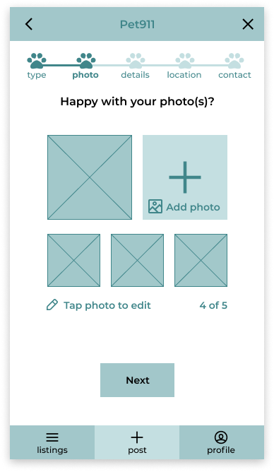
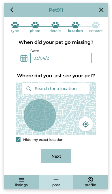
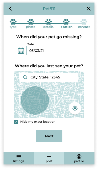
Once we had finished analyzing the guerilla usability tests and ideating solutions to the critical issues we turned our sketches into mid-fi wireframes and implemented the changes asked of us by the stakeholder and based on our insights.






Changes Implemented
Homescreen
We adapted the Home Screen to be more usable and conform to requests from the stakeholders.
Changes:
We removed the Back Button on the header to make it clear this is the home screen.
We changed the copy on the “I Want To Help” button to “I Want To Volunteer” allowing it to be consistent with the website. We also added an asterisk to explain to users what volunteering would entail. And made it clear it was a button by adding a box around it.
We also moved the “Post” button in the navigation bar to the center to increase visibility and importance.
Two Flows, One Progress Bar
After testing we found that having two different listing flows worked well, however we found that the order of questions in the “lost a pet” flow was more intuitive to users. So we changed the order in the “found a pet” flow to match.
Registration
As per request of the Stakeholders we added a Registration page to both listing flows, asking the user to create an account before beginning a listing.
We made sure to clearly explain the reason for requesting personal information, before beginning the listing process, was to help the user. We decided to request an email address, as the stakeholders wanted this information to contact users via email to entice users to return to the platform.
Contact Field
Because we added a registration page at the beginning of the listing process we made the contact page more concise and user friendly.
During testing we found that there was confusion with the contact page:
Users did not understand why they were hiding information and from whom.
They also expressed that there were a lot of fields and it seemed overwhelming.
Changes:
We added clear copy to indicate that the information on this screen is for people to contact the user about their listing.
We reduced the number of input fields to reduce cognitive overload and so the user would not have to input their email a second time.
To reduce the number of steps a user has to take we made the input optional instead of asking users to “hide” the information.
We changed the language of the “Boost For Free” button to “Post without Boosting” to increase the number of users who would choose to boost their post.
Lastly we changed the “I Want To Volunteer” button to “I want to be informed of missing pets in my area” so that users would not have to guess what volunteering entails, and would be more likely to keep the box checked.
Boosts
We also redesigned the “Boosting” screens and process to be clear and concise. We believe the changes will ultimately increase the number of users who choose to “Boost'', which was one of the goals of our design as it is Pet 911’s main source of revenue.
Two users were confused about what exactly the paid options would do. They wanted to know:
Where the post would be shared.
Who would see it
Changes:
We reduced and combined the number of paid services from six to three in order to reduce cognitive overload and choice paralysis.
We added a bottom sheet with friendly non-committal language that encourages users to boost their post when they choose to opt out.
We added clear descriptive copy to the boosting options to inform users of what boosting entails and why they should do it.
Push Notifications
As the last step in the listing process we updated the “view your post” page. We wanted to make sure users could easily view the completed post after finishing the listing process, as well as edit and remove it.
We also created push notifications so that users would get confirmations that the services they had paid for were successful to help build trust and keep users feeling in control.
Other Changes:
We added an icon to the edit option.
We added a more options icon to the top right of the post and moved “delete post” there.
We added a mark as found option in the delete options place.
We added an affordance to indicate that the users could swipe to view more photos.
We added a large CTA to post another listing.

Ending on a positive
After we completed our wireframes we sent them to the stakeholder and had a meeting where we presented the changes and thanked them for the opportunity. View PDF of Presentation Slides
The stakeholders were incredibly pleased with our work thanked us, saying that they had never realized how helpful preliminary research was when designing interfaces and that they would continue to implement our process in the future.
Next Steps for Pet 911
Before we finished our call we gave some suggested for next steps. We suggested that as Pet 911’s user base grows, they should tailor the requested info to cultural norms, such as rewriting copy and adding or removing culturally informed fields to the listing process. We recommended that moving forward they should use the research and screens we created as a jumping off point to ideate other features in the app. We also suggested that they continue to test new features and pages as they are created and suggested further user testing of the mid-fi wireframes to help mitigate usability issues before beginning development.
After the project was over I began to play around with some high fidelity concept designs.
I created screens of the onboarding process to play around with what a finished redisign of Pet911’s mobile website could ultimately look like.

Excited for future collabs
Through communication, collaboration and hard work we were able to deliver wireframes for a clear, intuitive streamlined listing process for the Pet 911 app. Working with the Pet 911 team and my co-students at Springboard gave me invaluable experience that helped me to improved my leadership skills, learn how to approach geographic and cultural obstacles and help prepare and excite me for future design challenges.


